Sunday, August 17, 2014

Canadian Rockies gear recap, volume 2

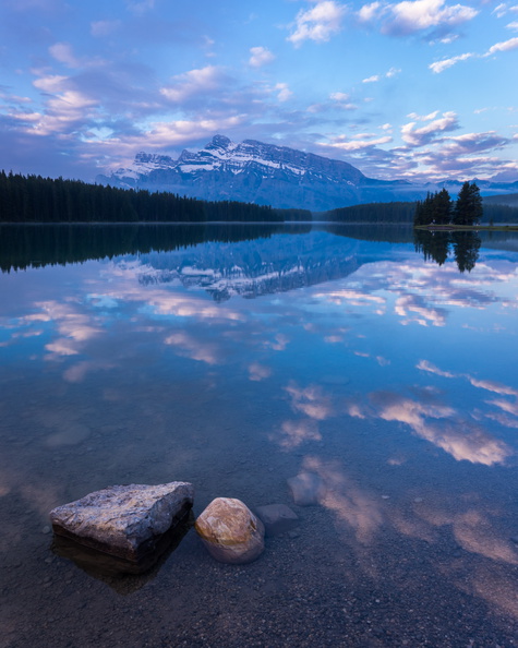
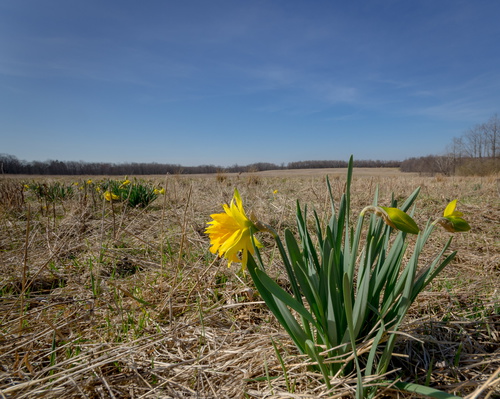
This is the second installment in a series evaluating the utility of photographic gear I took on vacation to Banff National Park and the surrounding area. In this installment, I’ll focus on the camera and lenses proper.

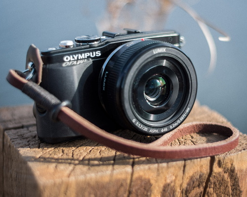
  • Pentax K-5 II: A. My APS-C DSLR performed admirably throughout the trip. It is relatively compact for its capabilities, and I love the 16 MP Sony sensor. It has a ton of dynamic range and is very forgiving in terms of exposure. The autofocus generally performed well on the trip.

As far as lenses go, I thought it would be instructive to figure out what percentage of my shots from the trip were taken with each lens. The table below lists the totals for each lens. The “keepers” are taken to be the images in my gallery from the trip.

Lens % of all exp. (n=1,079) % of keepers (n=63)
Sigma 10–20 mm f/4–5.6

20%

17%

Pentax DA 16–45 mm f/4

18%

27%

Pentax FA 50 mm f/1.4

0%

0%

Tamron 70–200 mm f/2.8 Di  Macro

31%

44%

Pentax FA 100 mm f/2.8 Macro

1%

0%

Pentax DA* 300 mm f/4

29%

11%


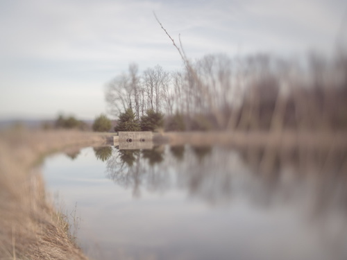
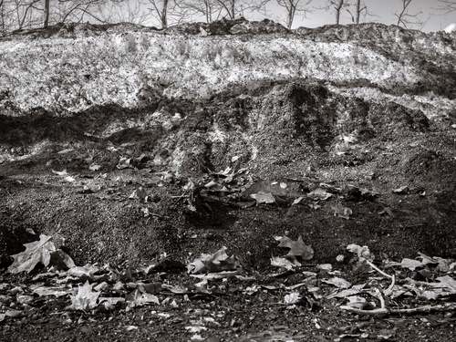
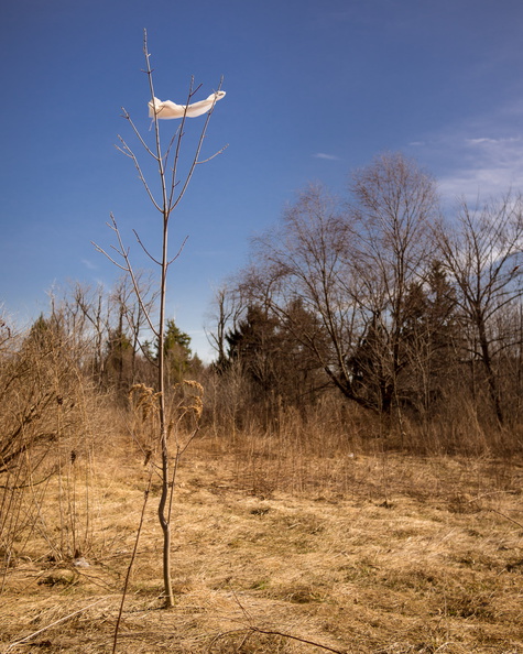
  • Sigma 10–20 mm f/4–5.6: A−. The Rocky Mountain landscape is made for ultrawides. If you’re going and don’t have one, at least consider renting one for the trip. This lens gets a slight grade reduction because it’s soft in the corners, with noticeable field curvature and astigmatism. Pricier options like the Sigma 10–20 mm f/3.5, Sigma 8–16 mm f/4.5–5.6, or Pentax 12–24 mm f/4 might yield better results, but I still consider my lens to be a great value.
  • Pentax DA 16–45 mm f/4: A−. This versatile lens saw a great deal of use on the trip, and in the overlap region with the 10–20 mm, I prefer the 16–45 mm. It also gets a light grade reduction because I think there’s something amiss with my copy, which I didn’t appreciate before the trip. The left and right edges are noticeably soft at all apertures, with the right side being worse than the left. I may send it in for servicing this winter.
  • Pentax FA 50 mm f/1.4: C. It’s a great lens, but I don’t think I ever mounted it on this trip. The zooms were more versatile, and I didn’t have any need for the fifty’s speed. At least it’s small and light.
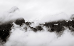
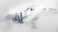
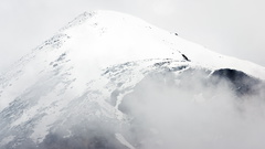
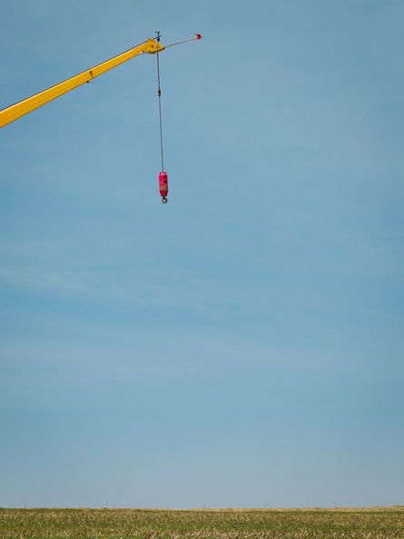
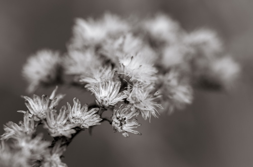
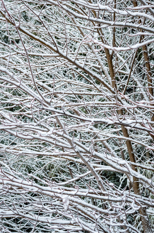
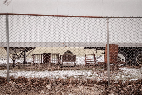
  • Tamron 70–200 mm f/2.8 Di  Macro: A+. This was a last-minute purchase before the trip, and my gut feeling during the trip was that I could have lived without it. But looking at the images when I got home, I realized that was a totally wrong impression. This lens was a superstar, a wise purchase and great value. Tack-sharp and versatile, I used it to isolate the scenery and create intimate compositions. It was also a good choice for much of the wildlife that we encountered.
  • Pentax FA 100 mm f/2.8 Macro: D. I only used this lens to photograph a couple of moths to show my dad. I just didn’t shoot much macro on this trip, and the close-focus capabilities (and fine image quality) of the 70–200 mm would have sufficed. Though modestly sized, it’s a heavy lens, and just didn’t earn its spot on this trip.
  • Pentax DA* 300 mm f/4: B. An excellent lens, I expected to use it a great deal for wildlife and birds. But I shot few birds, and the 70–200 mm was generally a more versatile choice for wildlife.
  • Tamron 1.4x Pz-AF MC4 teleconverter: B−. I’m not sure if I used this at all; if I did, it wasn’t that much. But, it might make sense to leave the big 300 mm at home, and use the teleconverter with the 70–200 mm when necessary.

Monday, August 11, 2014

Canadian Rockies gear recap, volume 1

My June 2014 trip to the Canadian Rockies was the first time that I needed to travel by air with a large amount of photographic equipment. In the aftermath of the trip, I wanted to reflect on which items “earned” their space on the trip, and which I could have left at home. This series of posts collects my thoughts on the topic.

Sunday, August 10, 2014

Gallery: Canadian Rockies

Over the course of the past couple of months, I’ve been posting photos from my recent trip to Banff National Park and surroundings. The gallery is now complete, and I invite you to enjoy it.

Sunday, June 29, 2014

Mountains and Clouds desktop wallpaper

I’ve made some desktop wallpaper from my Canadian Rockies photography, which you are welcome to use for personal, non-commercial purposes. Enjoy!

16:10 aspect ratio
1680 x 1050
1920 x 1200
2560 x 1600

16:9 aspect ratio (suitable for dual monitor)
1920 x 1080 1920 x 1080
2560 x 1440 2560 x 1440

Saturday, May 17, 2014

Notable works at the Carnegie Museum of Art

I visited CMOA today for the confluence of about five photographic exhibitions, along with the PGH Photo Fair. None of the exhibits thrilled me quite as much as the Yours Truly exhibit last year, but the variety and quantity on display this year was impressive. I think the highlight of the day was the Architecture+Photography show, primarily for introducing me to the work of Ezra Stoller. I was particularly pleased to see that Stoller photographed the McMath-Pierce Solar Telescope at Kitt Peak. Johnstown native Luke Swank was also represented in Architecture+Photography and elsewhere in the museum. His signature on the prints really is the draftsman-style signature depicted on the cover of the book. I also enjoyed seeing Joel Sternfeld and Zoe Strauss prints in the Outtakes exhibit. And if I had an extra $4,000 lying around, I’d have been very tempted by an Eadweard Muybridge pigeon-in-flight motion study that was for sale at the Photo Fair.

I also enjoy seeing the non-photographic works of the museum, particularly the modern pieces, and I wanted to share with you some of the most interesting. Oddly, many of these were missing their gallery tags, requiring me to research them myself.

20140517-EPL5-02377

Artist Unknown
Conical Form #17 (1997)
This sculpture is in a temporary installation outdoors, with several related works. The black octagonal base anchors the work to the earth, while the slender corpus of the work reaches heavenward. This symbolizes the duality of our finite life—we are embedded (stuck, really) in the reality that surrounds us, but we constantly strive for something greater. A related work in the installation tempers the ambition of Conical Form by calling for caution.

20140517-EPL5-02378

Artist Unknown
Untitled (2014)
This recent work was commissioned by the museum. It reminds the viewer that preparation is essential to success—a visual retelling of the aphorism that fortune favors the prepared mind. Graphically, the negative space around the piece makes it more significant than its dimensions would suggest.

20140517-EPL5-02380-Edit

Simplex Grinnell
Flammable/Inflammable (2003)
This assemblage combines a number of industrial elements, including a metallic cylinder (painted red), a dial, and a rubber hose. While the cylinder is printed with “Instructions”, those are merely evidence of Grinnell’s trademark humor. This is not, in fact, an interactive exhibit, as I’m sure the docents have had to tell numerous patrons. Despite that, the work is clearly one of optimism for the modern age, as evidenced by the needle pointing to the green “good” region of the dial.

20140517-EPL5-02393

Sherwin Williams
Pintura Fresca (2014)
This groundbreaking work is installed in an unusual gallery within the parking garage, making it nearly as hard to find as the Teenie Harris exhibit. Like many modern works, this one is about the materials of painting. What sets this work above the rest is its ephemerality. It’s not just about brush strokes or canvas texture, it’s about the very wetness of freshly applied paint. What will happen when the paint dries? Will the sign remain, an ironic statement about the transitory nature of accuracy? Perhaps the artist will re-apply the paint, making it more of a performance piece. Or perhaps the work will be dismantled, having enjoyed its brief but glorious contribution to the modern canon. If the latter is the case, I count myself exceedingly fortunate for having visited at just the right time.

20140517-EPL5-02400

James E. Rohr
Automated Tragedy Machine (2007)
This interactive installation challenges the viewer to a number-guessing game, and rewards the successful with a cash prize. But the displayed text suggests a darker truth—life is a zero-sum game, and the amount won will somehow be deducted from the “winner’s” other assets. This work is multilingual, allowing all visitors to experience the unsettling philosophy that it espouses.

Friday, April 25, 2014

Photo Tips for Mom: Burning in the edges

When I printed in the darkroom, I would usually take a piece of cardboard, and use it to block the light in a way that the edges of the print would receive additional exposure. This was called “burning in the edges,” and it would make the edges of the print slightly—almost imperceptibly—darker. Why did I do this? Well, because Ansel told me to. But the real reason is that our eye is drawn toward brighter parts of the print, and darkening the edges slightly keeps the viewer’s eyes from wandering out of the frame.

Thursday, April 24, 2014

Freelensing

This evening I played around with freelensing—holding a camera lens in front of the camera without mounting it, so that you can tilt and move the lens around freely. Like a tilt-shift lens, this allows the plane of focus to be other than a vertical plane in front of the camera. Unlike a tilt-shift lens, it’s very hard to control precisely.

Sunday, April 20, 2014

Photo Tips for Mom: Querying keywords

Querying, or searching, your Lightroom catalog for photos with certain keywords is done in the Library module.

The search will work by narrowing down, or filtering, the displayed photos to show only those with a certain keyword. So we have to start by showing all the photos that we want to search. Use the panels on the left to choose your starting point. One common option would be All Photographs:

Catalog-AllPhotographs

Once you’ve picked your starting point for the search, expand the Keyword List panel on the right side of the screen, and find the keyword you want to looks for. You can do this by expanding the tree, or by using the search box.

When the keyword you want to search for is visible, hover over it, and a right-facing arrow will appear:

KeywordList-SearchArrow

Click the arrow, and your displayed photos will be filtered down to those that have the keyword. Note that anything underneath the selected keyword will be included, so searching for Birds will include American Robin.

Lightroom’s filtering capabilities extend beyond keywords. In the Library Filter boxes that appear at the top of the screen, you’ll see that you can filter on all kinds of parameters, such as the lens used. The filter panel will show four things to filter on, but you can change each of those by clicking on a search parameter:

Filter-Change

To stop filtering, click None:

Search-None

Photo Tips for Mom: Applying keywords

Lightroom has a number of ways to set keywords for photographs. Keywording is done in the Library module.

One Shot image-by-image recap

I wrote about a few images in depth, but for most I didn’t have much to say, and let the image speak for itself. Since the point of the project was to see if I could make a decent image with only one shot, though, I thought I should offer some opinions about how well each image succeeded.

Saturday, April 19, 2014

Photo Tips for Mom: The exposure triangle

There are three main camera settings that affect the exposure of your photograph. Each of them has side effects, in addition to their effect on exposure.

Exposure is measured in steps or (colloquially) stops, which are factors of 2 in brightness. For example, a difference of 3 stops is a difference of 2×2×2=8 in the amount of light.

One Shot #46 | Crane

Sunday, April 13, 2014

One Shot #40 | Palm

Photo Tips for Mom: Aspect ratio

Aspect ratio is the ratio of the length of  one side of an image to the other. The sensor in a digital camera (or the film format in a film camera) will have a “natural” aspect ratio determined by its size. For 35mm film, the aspect ratio was 3:2 (=1.5), and most DSLRs use the same. Some medium-format film cameras shoot square, or 1:1 (=1.0), images. Your E-PL5 has a 4:3 ratio, which gives the Micro Four-Thirds format its name. The 4:3 (=1.33) ratio is the same as “old-style” television, and is closer to square than the 3:2 (=1.5) DSLR ratio or the even wider 16:9 (=1.68) ratio of an HDTV.

Note: In some cases, people maintain the convention of keeping the horizontal dimension first (e.g. 4:3 for horizontal, or landscape, images, and 3:4 for vertical, or portrait, images). In other cases, they don’t, and think of aspect ratio as being independent of orientation (so a 4:3 aspect ratio could be in either landscape or portrait). Usually the meaning is clear from context.

While your camera has a natural aspect ratio, which is the starting point of your files, you can change the aspect ratio through cropping. The crop tool of Lightroom’s Develop module is accessed through the “dashed rectangle” icon above the Basic panel:

CropPanel

The crop tool lets you drag the border to crop the image. If the padlock icon is locked, the aspect ratio will be locked (so dragging a horizontal border also moves the vertical borders to maintain the aspect ratio, and vice-versa). If the padlock is unlocked, you can drag the borders independently, changing the aspect ratio.

In the Aspect drop-down, you can choose from widely-used aspect ratios like 4x5/8x10 (a common print size) and 2x3/4x6 (the famous 3:2 ratio of 35mm film and DSLR cameras). You can also add custom ratios and save them for re-use.

Why might we change the aspect ratio? There are a few reasons:

  1. As we’ll discuss in a future installment, photographic composition depends on exclusion as much as inclusion. If something is distracting, or doesn’t contribute to a scene, we often choose to exclude it. The decision to crop something out of the scene, while maintaining the elements we want to keep, may necessitate changing the aspect ratio.
  2. There’s a psychological component to aspect ratio. In horizontal (or landscape-oriented) photos especially, a wide aspect ratio can imply opennness, or a broad vista. It can create a dynamic space—for example, a space for the subject to look or move into. In contrast, a more square aspect ratio, like the 8x10 format, can feel intimate.
  3. Our eyes have a narrower vertical field of view than horizontal, so for vertical compositions, I feel that squarer aspect ratios, like the E-PL5’s natural 3:4, or even 8:10, work best.

And now, a rant: Lately, my Facebook feed is full of phone-camera shots in a 16:9 ratio, like HDTV. This is, presumably, the native sensor size of some phones these days. For horizontal compositions, 16:9 is sometimes a good choice. For vertical shots, however, it’s usually horrible. There’s typically a toddler’s head in the middle of the frame, and acres of pointless background above it. Whatever phone designer thought this was a good idea should be dragged out back and shot. If nothing else, the phone should default to cropping more square during vertical composition.

The conclusion: When cropping, don’t be beholden to your camera’s native aspect ratio. Try different aspect ratios to include or exclude the elements you want, and convey a sense of openness or intimacy to the scene.

Saturday, April 12, 2014

One Shot #39 | UVA

Photo Tips for Mom: The quality of light

Introduction: Many writers, especially tech writers, employ the “explain to Mom” trope in a patronizing way, with the implication that “Mom” is a bit dim. This is not the case for my new series. I am writing for my literal mom, who is an intelligent person who happens to be new to photography.

In accordance with Best Practices for Familial Tech Support, Mom is using equipment that I’m familiar with: An Olympus E-PL5 mirrorless camera with two lens kit, VF-3 electronic viewfinder, and Lightroom 5.

The natural tendency of new photographers is to see something beautiful or interesting, and photograph it, with the expectation that a good photograph will result. Often, the result is disappointing, and it’s because the light did nothing to improve the photo.

One Shot #38 | Museum

A model of the future Westmoreland Museum of American Art, taken at a happy hour at their temporary facility.

Confession: I also took some pictures of my mom and Jill at their request, and some test shots with my mom’s new-to-her camera. More on that later.